First off, notice the title: Color “Theory”. Art and science are different because Artistic Theories will most likely never become laws. Everyone has their favorite colors, ways to create them, and how they feel about them. That is how art is so uniquely diverse among artists.
That being said, it’s always good to have some direction and insight into other people’s thoughts on color, how they are used, and why. Not only can you learn from others and utilize their ideas, studying other peoples’ work will also help you grow and find out what you personally like and dislike.
Basics of Color
Primary colors are the basic colors that cannot be created from any other color. They are Red, Blue and Yellow. In their pure form these three color can command eye catching attention, so use them wisely.
Secondary colors are colors derived from the primaries via mixing. Orange, Violet and Green are secondary colors. As with primary colors, in their pure form these colors demand attention and care in their use.
Complementary colors are colors found directly across from each other on the color wheel. This is valuable information for several reasons. As a color scheme, complementary colors have a very high hue contrast value. Because of this, they “complement” each other well and tend to visually pop well. Colors can also be darkened via their complementary colors in a more rich and saturated way than just adding black. A true black tend to deaden a color while darkening it. Mixing 1 part green to 2 parts red will give you a rich deep red, and similarly, 1 part red to 2 parts green will give you a deep rich green.
Neutral tones are colors that tend to be an even mix of the three primary colors or complementary colors. These tend to be known as shades of brown and grays. While by themselves they seem to be less interesting, used next to other primary tones they can create a rich contrast and show off other colors well.
Warm and cool colors are something else to consider, not only in the base color scheme, but also in how you shade and highlight. Warm colors tend to be colors associated with yellow: yellow, orange, red and some violets. Inversely, cool colors tend to be associated with blue. Colors like green, blue and some violets are cool colors. The human eye sees warm colors as something that stand out and attract attention and cool colors as something that recede away in comparison.
The Physics of Color
Why do warm and cool colors create a feeling of depth? Have you ever looked out over a land scape and noticed that the mountains or terrain far away tend to be blue-gray? The wave length of yellow light is small and rapid and the wave length of blues are longer and higher. Because of this, particles and debris in the air deflect yellow light waves more often as the stronger blue light waves keep on trucking. So after light travels more and more through our atmosphere, it tends to turn more blue. We can use this to our advantage and have things we want to recede, a more cool color.
Light reflection seems to be all physics, and not a hair artistic, until you start to take into account how color interacts with the light. When a pigment color receives light, it absorbs only those colors of the spectrum that belong to it. So we can only see that part of the spectrum that it reflects. This is one reason I personally do not use black. A true black absorbs all light and to our senses creates a dead spot visually. If I ever am lining or working with letters/graphical shapes I use a deep blue or red-brown depending on my color scheme.
On a similar note, larger surface areas, for obvious reasons, reflect more light than smaller areas. This gives us several hurdles to jump, or use to our advantage if we know what to expect. While painting on a larger surface any color will appear to be slightly lighter than if it were painted on a smaller surface. A perfect color match on a large Jack might not be enough to give that color the same feel as on a trooper. Often you may have to bring up the highlights a touch more, or the shadows of a large Jack a touch deeper in order to gain a similar feel of your colors.
Miniatures are so small they obviously reflect less light. Because of this, a single color applied to any one area looks flat and one dimensional even on the most textured or wavy surface. We compensate for the physics of this by creating false highlights and shadows with our paint jobs. Small shifts in tone, hue and color on an edge, dip or bump with any surface, done correctly, helps the human eye see the fine detail and correct size relationship that we are trying to obtain.
When you start to develop your control of colors in relationship to the shape, eventually you will start to understand how light falls onto a shape. This naturally leads into understanding how natural light from the sun falls onto a Jack or man shaped mini. A quick way to judge or learn this, is to turn off all lights but one, and have a single hard light source shining closely onto your mini. Over time you’ll be able to figure this out without altering your literal light source, and even be able to turn your miniature upside down and realize the difference in where you should be laying down your colors.
Color Schemes for Paint
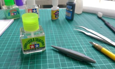
The first thing to consider when figuring out a paint scheme is knowing what you have to work with. With all paints and paint containers you’re never going to know truly what you’re working with while it sits in its jar or bottle. First, because all acrylic paints dry a slight shade darker than when wet. Trust me, you know you’re getting your layers close together when you lay down a medium tone of grey next to your previous layer and it looks the same wet, but then can see the color you were going for once it dries that extra shade darker. And the other, more obvious, reasons are the containers: some are a glossy plastic and others a milky white dropper bottle. Because of this, the very first thing I do with any new paint I buy is to make a color chit of it. I have a long 1 inch wide strip of some fairly thick styrene that is primered white and scored across it every quarter inch or so. So all I have to do is snap off a new chit (which ends up being 1 inch by a quarter inch wide), write the name of the new paint on one side with a permanent marker and then give the other side a solid coat of this paint.
With all of my paints on chits, I can create a clear picture of what colors go well with each other by laying common looking colors near each other, scooting them around on the table and letting my mind’s eye build ideas on what I want to do. After I have a few colors I like for a scheme, all I have to do is turn the chits over and grab the paints listed on the chit.
Often when you are just learning to paint, its best to keep schemes more simple and less frustrating. A single color, with maybe one or two colors that might be applied to a few smaller areas could be appropriate. While more experienced painters may even pick multiple colors for highlight and shading tones for a single base color or even have some multiple colored schemes. Complex colors schemes are not the mark of a good painter, as even the most simple schemes can be a thing of beauty, but a newer painter can quickly become overwhelmed with the complexity of a multiple colored scheme.
Color and Art
Mixing and choosing colors when the brush meets the primer is where it all happens. At times, this is easier said than done. Study photos and illustrations for inspiration of what colors you want to use. At times, using a small paper mask via cutting a small hole in a sheet of paper can help identify a specific color. Often a flowing and changing color can be very dynamic in its color shifts and fool your eye with what colors are actually being used.
Little things like how you shade and highlight your colors can change the look and feel of the miniature. A common primary or secondary color can be highlighted and shaded in numerous ways. Take red for example. Mixing in white as a highlight and black as a shade will give you pink highlights and dull shades. The same red mixed with bleached bone for highlights and a touch of green for shades will create a more realistic look and feel for a primary red and keep you away from the pinks and flat tones. The same red again can be mixed with yellows for highlights and blues for shades, this will produce a much more primary and electric look and feel. With the same red one more time, try a yellow ochre for highlights and deep ruddy brown for shades and you will get a more neutral tone and earthen color feel.
But most of all, read, ask others that paint, and experiment! Be willing to grow and try things out. This is what will lead you to become a better painter above all the rest.
Below is a copy of a color build sheet given to me by an instructor in college. You’ll notice that they are listed with traditional artist colors, and not a total perfect translation to miniature paint colors. So, keep in mind that you do see black often, and also need to know that oil paints mix much differently than acrylics. You can quickly start to see how some color builds can be rather dramatic, as well as noticing certain patterns emerge. This list is usually within arms’ reach of my desk when I’m painting, so enjoy!
Colors That Can Not Be Made By Mixing
• Red
• Yellow
• Cerulean Blue
• Ultra Marine Blue
• White
Metals and Woods
• Bronze = 90% Burnt Umber + 5% Orange + 5% Pink + Light green (for oxidizing)
• Steel = Blue Green + Cerulean Blue + Ultra Marine Blue + Violet + Black
• Silver = Values of Grey + Black + White (for highlights)
• Copper = Orange + Burnt Sienna + Blue (for shadows)
• Brass = Cadmium Yellow + Burnt Umber + Paynes Grey or Green (for shadows)
• Glass = Blue Grey + Black + White + Black (for shadows)
• Aluminum = Cerulean Blue + White + Black (for shadows)
Woods
• Pine = Cadmium Yellow + White + Burnt Sienna (for grain lines) Yellow Ochre + White (for highlights)
• Redwoods = Orange + Burnt Sienna + Blue (for shadows)
• Mahogany + Burnt Sienna + Red + Blue (for shadows)
• Walnut = Burnt Umber + Yellow Ochre Built up + Blue (for shadows)
• Cherry = Orange + Burnt Sienna (for grain lines)
Colors Not of Raw Origin
• Yellow Ochre = 90% Cadmium Yellow + 10% Violet
• Hookers Green = 95% Medium Green + 5% Red
• Indian Red = Cadmium Red + Burnt Sienna
• Burnt Umber = 3 Primaries + Blue
• Burnt Sienna = 3 Primaries + Red
• Raw Umber = 3 Primaries + Yellow
• Daveys Grey = Hookers Green + Black
• Paynes Grey = Cerulean Blue + Black
• Rose = 80% Cadmium Red + 15% White + 5% Blue
Skin and Hair Color
• Flesh Caucasian = 80% White + 10% Yellow + 5% Red + 5% Green (for shadows)
• Flesh African = 80% Yellow Ochre + 10% Burnt Sienna + 5% Burnt Umber + 5% Ultra Marine Blue (for shadows)
• Red Heads = Orange + Burnt Sienna
• Blonde = Cadmium Yellow + Yellow Ochre + Burnt Sienna
• Brunettes = Burnt Sienna + Burnt Umber + Blue
• Black = Burnt Umber + Blue + Black